
Introducing Viadog Subscriptions
September 16, 2020
2 min
To win new customers, a great design, clear offer, and smooth user experience is crucial. Here are some of our favourite subscription sites that you can take inspiration from, we’ll break down what’s working and why you should be doing the same.
Featured shops:
Decocrated create seasonally inspired home décor boxes which ship quarterly.
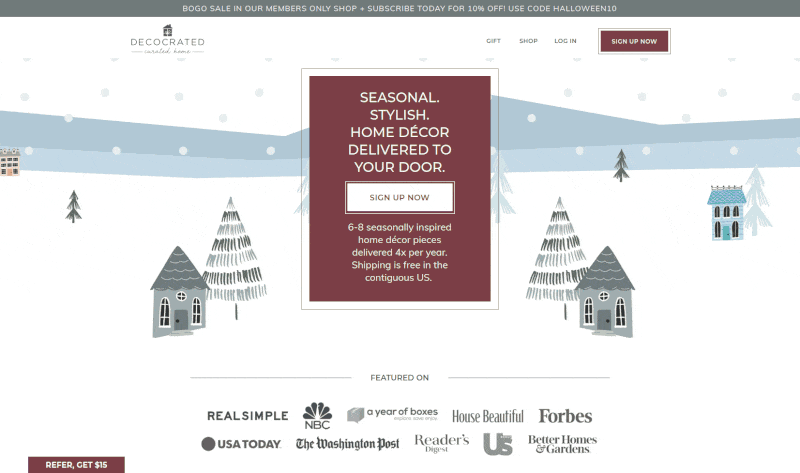
With a beautifully designed homepage, Decocrated ticks all the boxes. Starting with a clear, succinct offer above the fold, social proof, followed by an explaination of how it works, Decocrated get their point across quickly and clearly.
Subscriptions are then offered either quarterly or annually with just one click taking you to the ReCharge checkout page.
They then go on to explain how Decocrated is more than just a subscription company, there’s also a members only shop and dedicated Facebook community.
Common questions are then answered by the FAQ followed by a wall of happy Instagram customers and reviews.
To help further increase conversions, we’d consider:
Waldo sell contact lenses on subscription, shipping monthly, quarterly or bi-annually.
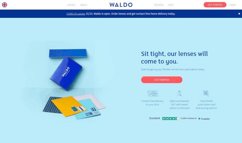
Waldo have sleek four step sign up flow (cleverly disguised as three steps) which takes you to the checkout in a minimal number of clicks. It covers:
You’re then taken to a custom checkout styled to match the website. Subsequent visits recall cookies which store your selections to take you back to the checkout without repeating yourself.
It would be interesting to A/B test the first part of the subscription flow.
MANSCAPED specialise in below-the-waist grooming products for men.
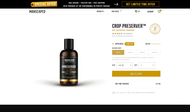
It’s very clear that MANSCAPED have put a lot of time and energy into perfecting their brand, products, and website.
From amusing product names, informative product pages with hillarious videos to clear call to actions, their website is built to sell.
Things we like are:
On the upsell screen after adding an item to the cart, the “checkout” button actually takes you to the cart, this step could be removed.
Pip & Nut make delicious natural nut butters without using palm oil.
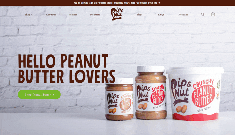
Pip & Nut’s website features bright, bold colours, crisp and clear product images combined with a handful of fun and playful interactive elements.
They pair great design with a high density of information without making the page seem crowded. We particularly like:
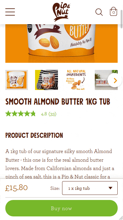
Special mention goes to the fixed add to cart section for mobile users which offers both one off and subscription purchases.
The only thing we’d change is to update the checkout link in the slide out cart so it takes you directly to the checkout rather than the cart as this additional step isn’t needed.
Doing this would lose the ability to update the quantity so it may be worth building this into the slide out cart itself.
Pique Tea create calming, healthy and immune boosting teas.
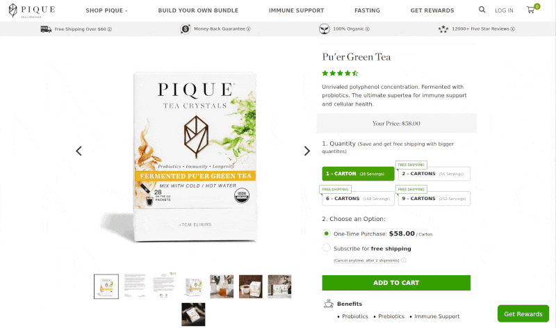
Pique Tea do a great job of signposting the benefits their products bring and the website is filled with social proof and glowing reviews.
Our favourite part is the products page, they offer a lot of information right where you need it to help answer questions you’d have such as the number of servings, benefits of a particular product and when you should consume it.
When scrolling down the page you’re met with a fade in sticky bar at the top of the window which features:
We really like this fixed bar and would hope to see it used on other shops.
There are a few things we’d look at if we were given the chance:
The London Sock Exchange are bringing socksy back by selling luxury socks on subscription.
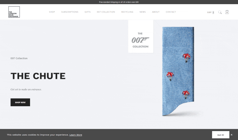
With a clean and minimilistic design, The London Sock Exchange effortlessly makes an impression on you, starting with a simple and effective sliding image to showcase the 007 Collection.
The entire website is distraction free with a clear focus on the product, a rarity these days.
Although beautifully designed, there’s plenty of opportunity to promote the subscription boxes, we’d start with a call to action on the homepage.
Also, with more shoppers using smartphones these days, the mobile view could do with some polish to bring it up to the standard of the desktop site.
Innermost create personalised nutrition products including protein shakes and supplements.
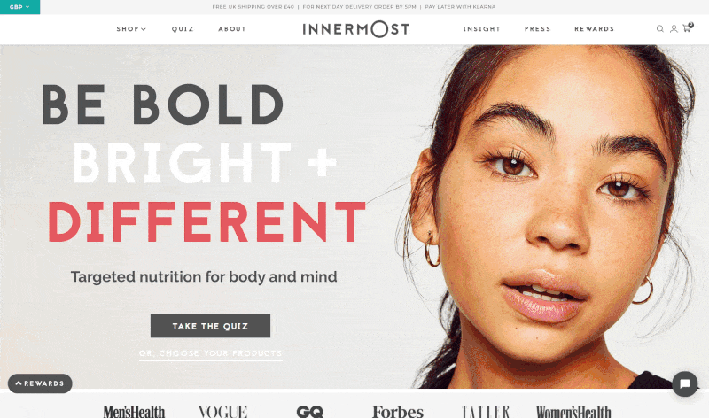
By mixing bold design with bright imagery and a mixture of fonts, Innermost create an energetic vibe which really symbolises what they stand for.
Their product pages not only make it simple to subscribe but combine product information, social proof, reviews and related products in a clean and effective way.
The cart page only displays non-subscription items whereas the slide out cart displays all products which can be confusing.
We got stuck on the quiz triggered from the homepage, this could be simplified by only asking for minimal information.
Get Golden create healthy energy bars with no refined sugars.
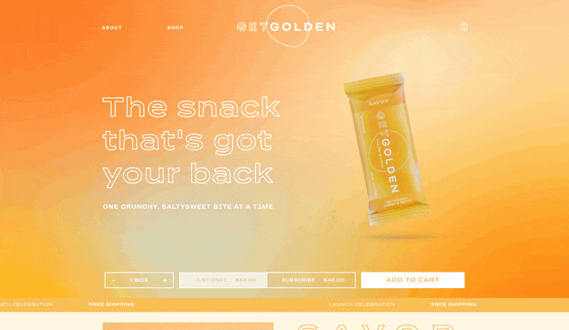
With a clear focus on the product and no fuss, Get Golden combines colour, fonts and imagery to create a fun and easy to use website.
What stands out on the products page are the three separate opportunities to add items to the cart. We’d love to see the data on this to see which works best.
On the desktop, the fixed bar at the bottom offers both one time and subscription purchases but unfortunately the subscription option is unavailable on mobile, we’d recommend finding a way to squeeze it in if possible.
BloomsyBox sell flowers by subscription, shipped directly from eco-friendly farms.
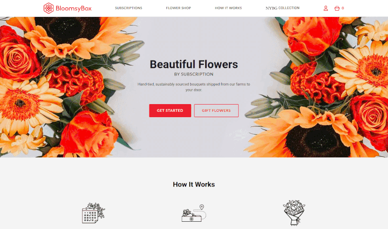
Following a recent redesign, BloomsyBox has simplified their subscription sign up flow to effortlessly onboard new customers. After picking your favourite bouquet, you simply select a delivery date, frequency then add the flowers to the cart.
Interestingly you’re limited to one type of bouquet per order but there’s plenty of choice available if you want more than one.
The recent redesign is a step forward from the old however we’d also consider the following changes:
Viadog Subscriptions helps to reduce subscription churn, get started with our free in depth analytics today.
Learn more / Book a demo / Register now
Any questions? Reach out to us on the contact page.